Market Trends
How to Pick the Perfect Photos to Communicate Your Brand Launch
By EyeEm Team - 4 min read

We marketed our new iOS app with un-stock photos from EyeEm Market
You’ve spent months innovating, building and testing. You’ve picked the name, the logo, the slogan. Now one question remains: How can you give your brand, app or product the presentation it deserves?
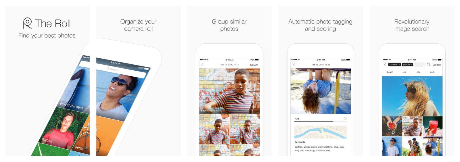
Our five app store screenshots.
When we launched The Roll, we asked ourselves exactly this. Our photo editors created a visual style for The Roll – and communicated the powerful message behind it – using images from EyeEm Market. Here are their takeaways.
Showcase Your Product
The Roll is an app that organizes the photos on a user’s phone and helps them find the best ones. We needed to market The Roll with images that demonstrated this – and also fit with the look and feel of the app.
To complement The Roll’s white, minimalist look, we wanted images that were eye-catching and colorful, with clean backgrounds and a sharp focus.
The images also needed to be memorable and strong – while looking like anyone could have taken them. Authenticity was key so as not to intimidate potential downloaders. Fake stock photos just wouldn’t have worked!
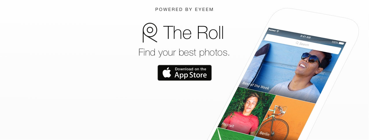
The header image for our Facebook and Twitter pages.
Our assets also needed to demonstrate variety, encompassing the many different types of photos in any user’s given camera roll. To show this, we covered a wide range of themes. We picked both a spectrum of dominant colors and included various subject matters, from portrait to still life, food and drink to macro detail.
Timing is Key
Making your launch appropriate for the season and taking events happening during that time into account is fundamental. So adapt your visuals accordingly! To coincide with our early summer launch, we used bright, sunny images. For a winter launch, dramatic mountains or cosy atmospheres may have worked better.
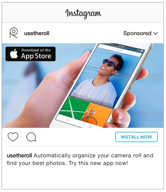
An ad we ran on Instagram.
Happiness Sells
We know the images that work best with the audience we are looking to target – and images with people often return better engagement. Those with a positive vibe have always done especially well, resonating more consistently with consumers. They’re relatable and they’re real! Alyona Gamm’s smiley portrait was the perfect lead image for The Roll campaign.
(For more on this, check out our 5 Golden Rules to Selecting the Best Visuals.)
Be Consistent
We used the same set of visuals across all of our communication and social media channels for The Roll, be it screenshots, videos, ads or app store banners. This ensured that we were telling the same story and being consistent throughout the user’s journey. Thereby we maximized conversion and ensured we were not losing users at various stages of the funnel.
Our photo editors’ curation provided the core of a campaign that delivered the message of The Roll clearly and effectively. The 21 photos were used across social media, the app’s webpage, in the app itself, as well as in the App Store.
The result? The Roll and the assets we created starred in global media and press outlets, were featured by Apple in App Stores around the world – and our social media campaigns have already garnered thousands of likes and views.
More tips on picking visuals for your brand:
– 7 Tips for Using Selfies in Brand Campaigns
– How to Choose Landing Page Images That Will Sell Your Product
– 6 Proven Ways to Use Images to Increase Social Engagement
Header image by @yiiin.