Market Trends
7 Tips for Choosing the Right Photos for Your Web Design
By Alexander - 5 min read

Know these essentials for choosing the right images
Web designers find themselves with a challenging combination of moving parts, either handed to them or open for selection. This is the fun of web design, using a combination of honed skill and personal style to piece together what your website will look like as a whole. As Product Designer at EyeEm, I know this game well. If you’re just starting in web designs and themes, read my 7 tips for choosing photoswhile building your websitewith software developers.
Looking for photos for your next project? Find photos from the EyeEm community in our EyeEm Market Collections. These are all available to license right now.
1. Bigger is better
You never know if someone is viewing your website on a 5″ phone screen or a 27″ monitor. Choose a photo that’s at least 2000×1000, so that it can display in high resolution on all types of display sizes.
2. Colors & Contrast
Go with photosthat share or support the colors of your design. If you intend to add elements on top of the photoand need to be flexible where those elements will be positioned, try to find photos with colors and contrast that have balance across the entire photo. If the photowill play a more independent role in your design and will set the tone for your message, select aphotowith bold colors and strong contrast.
3. Make use of white space
Depending on your page layout, look for photoswith supportive whitespace. If for example your design features a full-width photo with a left aligned headline, you want to make sure the headline has good readability and the important parts of the photo are not covered by design elements.
4. Tailor photos to your needs
Keep in mind, you can always crop a phototo adjust its appearance based on your needs. Unwanted elements at the corners of a photo can be easily cropped out of view, so the photo stays clean and uncluttered. This is where the three-parts grid (vertical and horizontal) can be a helpful tool. In the example below, we cropped the original photo from a landscapeto a square format to place important elements in the photo along the lines of the three-parts grid. This creates more tension between the bright and dark areas and brings more focus to our model.
5. Making space
When working with images of individuals or a group of people, make sure that the people portrayed have always a bit ofroom leftabove their heads and don’t get cut off on the edges. But also keep in mindnot to add too much space and dwarf the people portrayed through the weight from above.
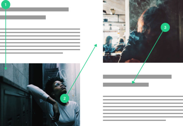
Another important aspect to consider is the so-called nose- or leadroom, which isthe amount of space inthe direction aperson or group of people islooking. When choosing an image, make sure that you have plenty of leadroom at your disposal. Otherwise, you create the unwanted situation of someone looking like they’re run up against a wall (a.k.a. the edge of the photo).
6.Create Guidance
Using the movement in a photo (or lack thereof) can be a helpful tool to guide the viewer along your website, based on your intentions. For example, photos for a website of a sports brand should support the brand’s message of speed, power and strength – whereas a website for a yoga studio will want to make its audience feel calm, relaxed and balanced. What you want in the end is to create a harmonic symbiosis between photos and information.
By SoHo Trendz &ほろよい
7. Don’t be amessenger, be the message
Nothing is more boring to a viewer than being greeted by another generic landscape or a grinning model. When choosing imagery for your website you want to get your audience as closely aligned with the core of your message as possible. Don’t choose an image just because it looks nice and fills a gap on your design. Rather, ask yourself if your copy couldn’t have been better illustrated by any other photo than the one you’ve chosen. Only then your imagery and content will create a bond which will make your message as strong as possible.
By
Ready to start selecting photos for your project? Find a wide variety of fresh and original photography to license on EyeEm Market.
Header image by @tasosritos